
Choosing interior paint colors is one of the most personal and sometimes paralyzing decisions homeowners face. The good news: with a systematic approach, you can make confident choices that you’ll love for years. Here’s how professional color consultants approach interior color selection for Tampa Bay homes.
Start with What You Can’t Change
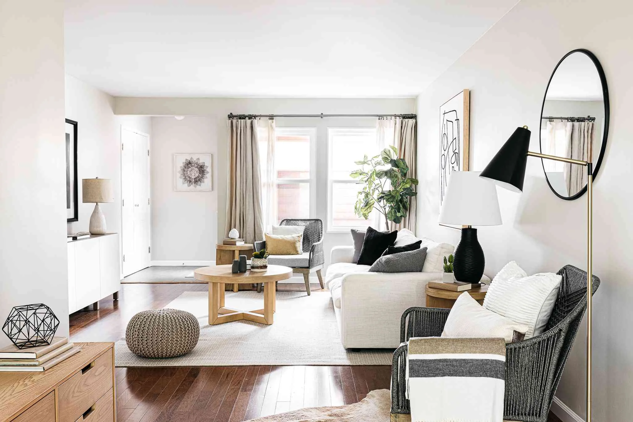
Don’t start with paint chips. Start with the fixed elements in your home that aren’t changing:
- Flooring: Wood tones (warm or cool), tile colors, carpet undertones
- Countertops: Granite, quartz, or solid surface colors and patterns
- Cabinetry: If you’re not repainting cabinets, their wood tone or existing color matters
- Fireplace Stone/Brick: Natural stone has undertones that should complement wall colors
- Major Furniture: Large pieces like sofas that you’re keeping
Your paint color needs to harmonize with these elements. It’s much easier to match paint to a floor than to replace flooring because you chose the “wrong” wall color.
Understanding Undertones
This is where most homeowners get tripped up. Every paint color has an undertone, a subtle secondary color that becomes visible under certain lighting conditions.
- Greige (gray + beige) colors may lean green, purple, or pink depending on the specific mix
- White can pull pink, yellow, blue, or green
- Gray often has blue, green, or purple undertones
- Beige can pull yellow, orange, or pink
The trick to identifying undertones: look at the darkest value of the color on the paint strip. The undertone is much more visible in darker shades. If the darkest chip looks greenish, the lighter versions of that color will pull green in certain lighting.
How Tampa Bay Light Affects Color
Florida light is different from northern states, and it affects how colors read in your home:
Bright, Direct Sunlight
Tampa’s intense sun floods south and west-facing rooms with warm, yellow-tinted light for much of the day. This light amplifies warm undertones and washes out cool colors. A cool gray that looks perfect in a showroom may look lifeless and sterile in your sun-drenched living room.
North-Facing Rooms
North-facing rooms receive cooler, blue-tinted light. This light can make warm colors look muted and amplify blue or green undertones. Consider warmer paint colors to compensate.
Artificial Light at Night
Most home lighting is warm (2700-3000K). This warm light makes colors appear more yellow/orange at night than they do during the day. Test your color samples at both 2 PM and 8 PM to see the full range.
Testing Is Non-Negotiable
Always, always, test paint samples on your actual walls before committing. Buy sample pots or peel-and-stick samples, apply them to 2-foot squares on multiple walls, and observe them at different times of day. The same color can look dramatically different on a north wall versus a south wall, even in the same room.
Popular Interior Colors for Tampa Bay Homes (2026)
Warm Neutrals
Sherwin-Williams Agreeable Gray (SW 7029): Still the most requested color in the Tampa market. It’s a warm greige that works in most homes with both warm and cool fixed elements. Looks best in well-lit spaces.
Sherwin-Williams Accessible Beige (SW 7036): Warmer than Agreeable Gray with a hint of sandy beige. Perfect for homes with warm-toned hardwood floors.
Sherwin-Williams Mindful Gray (SW 7016): A versatile warm gray with subtle green undertones. Works well in open floor plans for a cohesive flow.
Whites and Off-Whites
Sherwin-Williams Alabaster (SW 7008): A creamy, slightly warm white that doesn’t look stark or sterile. Popular for trim, ceilings, and entire walls in modern farmhouse or transitional homes.
Sherwin-Williams High Reflective White (SW 7757): A clean, crisp white with minimal undertones. Ideal for trim and ceilings. Use for walls if you want a bright, airy feel.
Sherwin-Williams Pure White (SW 7005): Very clean white with almost no undertone. The go-to for trim and ceilings.
Coastal-Inspired Colors
Sherwin-Williams Sea Salt (SW 6204): A muted greenish-blue that evokes coastal living without being obvious. Works beautifully in bedrooms and bathrooms.
Sherwin-Williams Rainwashed (SW 6211): Soft, spa-like blue-green. Popular for bathrooms and coastal-style homes.
Sherwin-Williams Comfort Gray (SW 6205): A sophisticated gray-green that’s calming without being cold.
Moody and Bold (For Accent Walls and Offices)
Sherwin-Williams Naval (SW 6244): Deep navy blue. Dramatic in home offices, powder rooms, or accent walls.
Sherwin-Williams Naval (SW 6244): Rich, classic navy with depth and sophistication.
Sherwin-Williams Iron Ore (SW 7069): Nearly black gray. Striking for exterior doors, accent walls, or built-in cabinetry.
Creating Flow in Open Floor Plans
Most Tampa Bay homes built since the 1990s have open floor plans where kitchen, living room, and dining areas flow together. Here’s how to handle color:
Option 1: One Color Throughout
The simplest approach: use one neutral wall color throughout the entire open area. This creates visual continuity and makes spaces feel larger. Use furniture, art, and accessories to add color.
Option 2: Defined Zones
If rooms have natural architectural breaks (columns, ceiling changes, or angles), you can use complementary colors to define zones. The key: choose colors from the same color family or with similar undertones so the transition feels intentional, not jarring.
The 60-30-10 Rule
A classic design formula: 60% dominant color (walls), 30% secondary color (furniture, curtains), 10% accent color (pillows, art, accessories). This creates visual balance and interest without chaos.
Common Interior Color Mistakes
- Choosing paint first: Don’t fall in love with a paint color before considering your fixed elements. Start with floors, counters, and cabinets.
- Not testing samples: Paint chips lie. The only way to know how a color will look is to see it on your actual walls in your actual light.
- Testing on colored walls: Existing wall color affects how samples appear. Test on white poster board if you can’t paint over the existing color.
- Ignoring trim: Trim and wall colors must work together. Most homes look best with crisp white trim, but the specific white matters.
- Overthinking: Paint is not permanent. If you hate it, you can repaint. Don’t let analysis paralysis prevent you from making progress.
Interior Painting in Tampa Bay
At Westchase Painting Company, we include color consultation as part of our interior painting estimates. We can help you navigate undertones, test colors, and make confident decisions that complement your home’s fixed elements.
Whether you’re painting a single room or your entire home in Westchase, Carrollwood, South Tampa, or anywhere in Tampa Bay, we’d be happy to provide a free estimate and help you choose colors you’ll love.